Curved Union

Curved Union
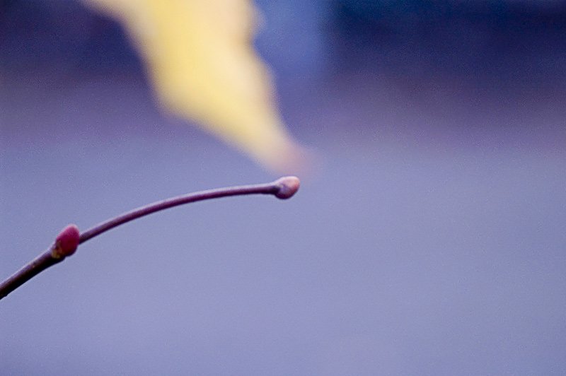
There is a lot that is wrong with this photo, starting with the focus. But then I like the delicate flame like twirl of the defocussed leaf in the background and the two elements in the picture seemingly touching at one point. Also, this is proof that Minolta’s body integral anti-shake works. There is no way I could have got this passably decent photo, shot in low light at 1/8 shutter speed, hand-held with a 100mm macro lens, if not for the anti-shake!

Chrome

Chrome
Furthur explorations in the world of macro. The object in the image should be pretty easy to guess, right? If you look closely you might just make out my tripod and me! And I love the bokeh of this lens. For those who do not know, bokeh (from Japanese, pronounced ‘boh-keh’) is the rendering of out of focus areas in a photo by the lens. For example, in this photo it is the stuff behind the object. This is a simplistic way of putting things but the smoother the bokeh the better the photo looks. Someone in a review for this lens had commented that the bokeh it gave was like melted cheese…I concur!

Blurred

Blurred
This image was actually a complete mistake. I was playing around with my newly acquired Minolta 100mm Macro lens when I inadvertently pushed the shutter release. As I was inside my house, in low light conditions the shutter was open for all of 30 seconds! I naturally thought the image would be one hell of a stinker but to my surprise I liked the result. So here it is. In case you are wondering what the blurred object is, it is the inner side of my Minolta 50mm prime lens! (A small corner on the left side of the photo was cropped out).

Streaks

Streaks
Yesterday, I finally got a chance to try a few night shots on the street with my Dynax 5D. This is one of the better ones. You will have to believe me when I say that those streaks of color in the foreground represent a passing car! (The top 1/4th of the image was cropped out to eliminate an over-exposed light source).

Shadows

Shadows
I wonder if any of you can guess what these shadows represent. Go ahead surprise me with your wildest guesses…or, is it too obvious? On a technical note, I thought of cropping the lower quarter of the image to remove the empty space and thereby tighten the image but thought against it in the end.

Faces

Faces
As the weather here currently sucks I haven’t gone out and shot anything new. So here is something from a trip to Berlin last year. This an art installation inside the haunting Jewish Museum by an Israeli artist. You can very well guess what it is for. The artist actually requests everyone to walk on these faces. But somehow it was very very tough for me to do that. It felt as if you are walking on real people. And perhaps that was the artist’s intention all along. If you ever find yourself in Berlin don’t miss this museum. Among the museums I’ve seen it alone makes brilliant use of light and space to evoke a feeling of great loss and sadness.

(There is no exif data for these images as they were taken on my Dynax 5 SLR. I also have to learn to do effective scans from my negatives. Somehow the scanned images end up looking grainy and dull).

Mottled

Mottled
Taken on a train while I was returning from Dresden to Berlin. The profile is that of a passenger who was seated roughly opposite me. She was quite curious as to what I was trying to do, fiddling with my camera, pointed at the window!